February 19, 2018 – With most movies and TV shows, it’s standard procedure is to put people in the middle of the frame, and have people take up most of the frame. Boring.
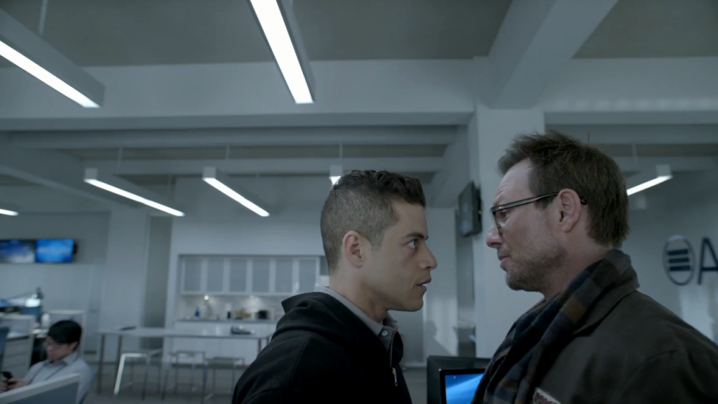
Compare that methodology to images below from Mr. Robot. They’re trying to offer something visually different. Thanks, Mr. Robot.

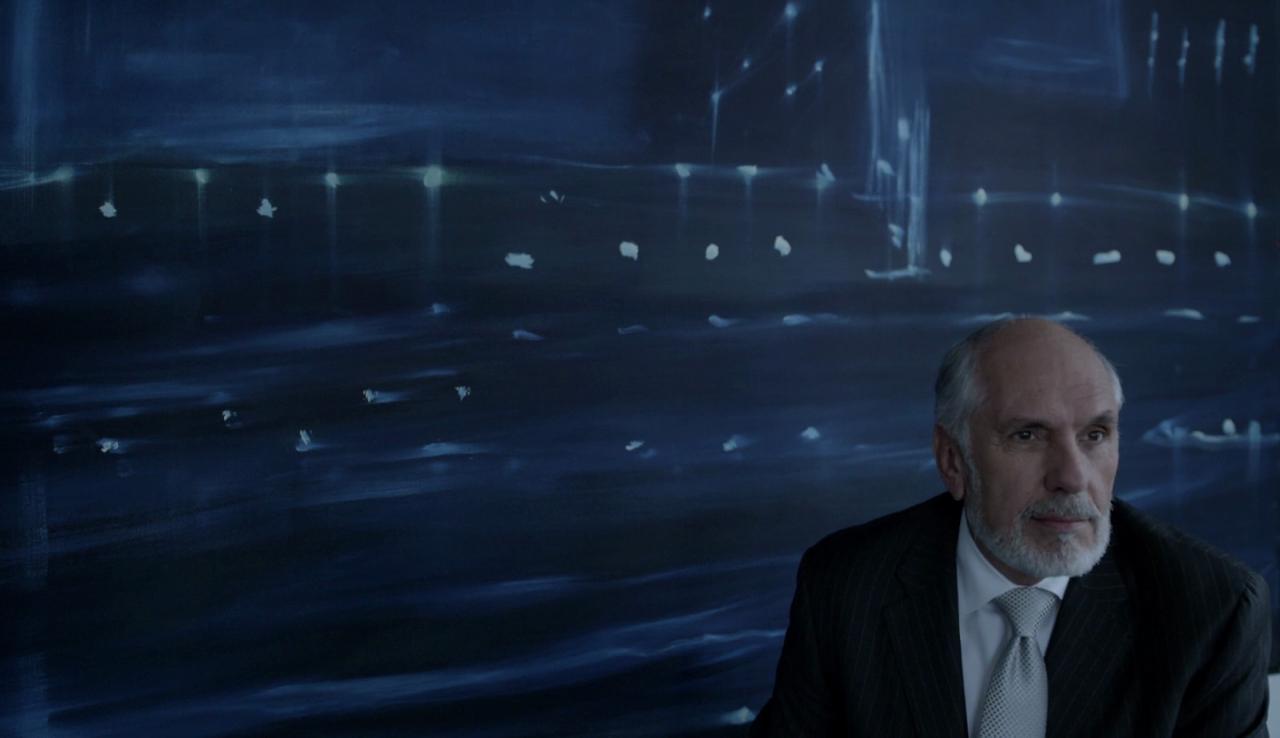

Some movies and shows also play with color and lighting. One of my favorite directors, Michael Mann, often has darkly lit, blue-hued scenes throughout his movies. Stills below are from Collateral, Heat, Miami Vice, and The Insider.

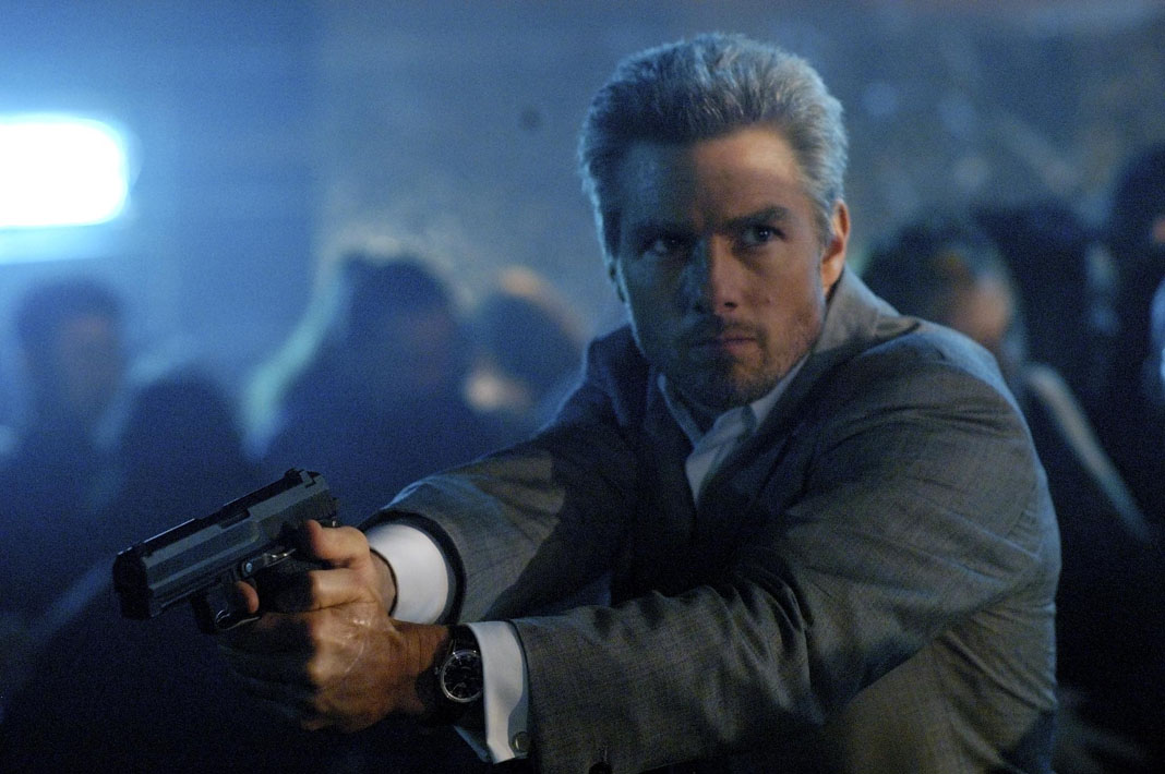
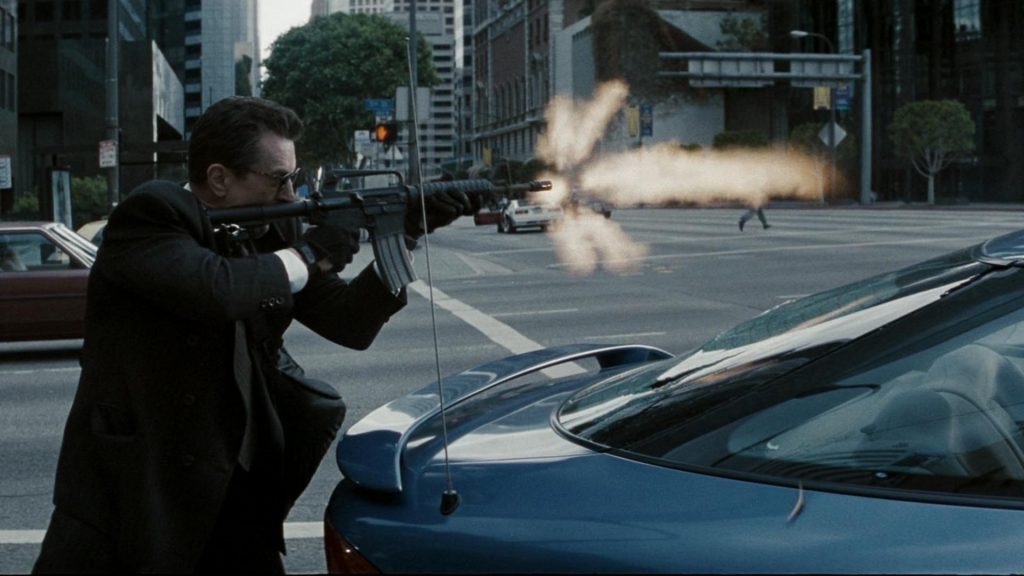
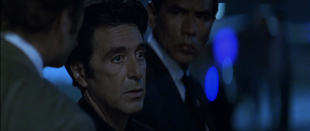
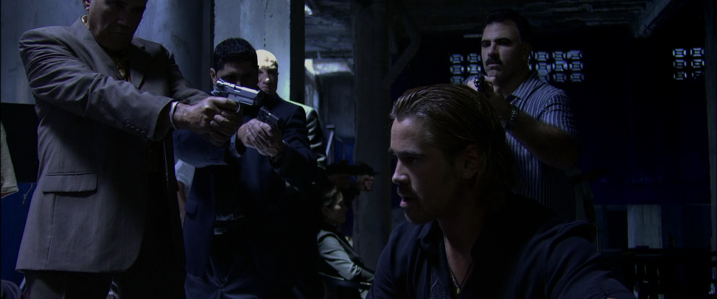
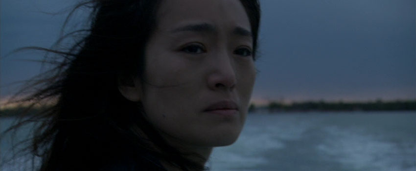

What’s the best cinematography in TV and film? For TV, as already mentioned, Mr. Robot deserves appreciation.
However, though it’s a gory show and I’m not a huge fan of horror, the best cinematography and art direction ever done on a major network show is NBC’s Hannibal. See images below. The fact that NBC even aired the show is remarkable. It must have slipped through the cracks. It’s more like something you’d see on HBO or Showtime, not a major network.
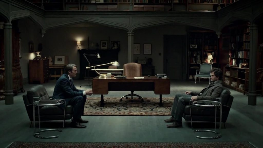

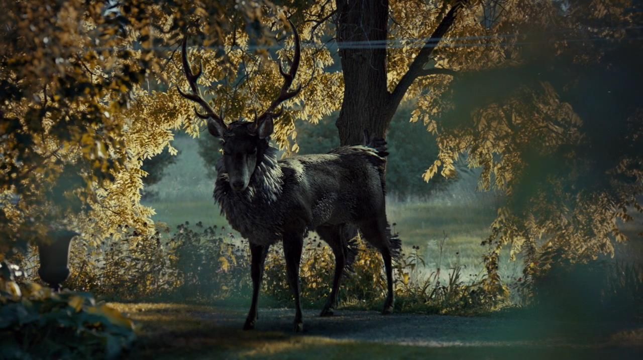

In film, I really like the look of the American version of The Girl with the Dragon Tattoo (2011), directed by David Fincher, cinematography by Jeff Cronenweth.
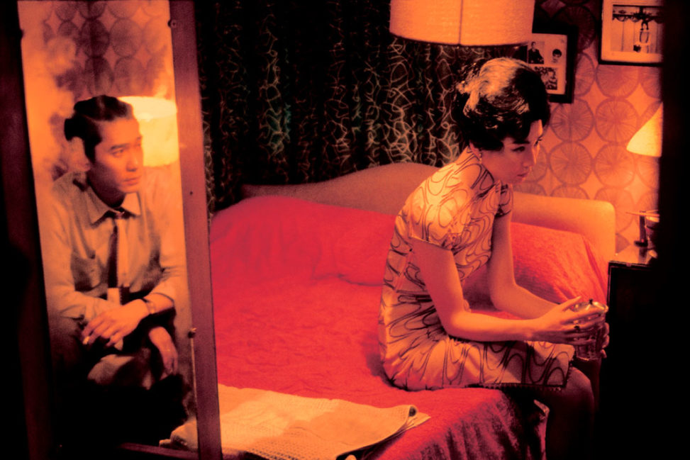
There’s also the movies of Hong Kong director Wong Kar-wai, such as In the Mood for Love (photo at top of this article).
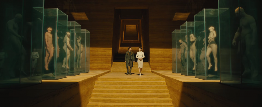
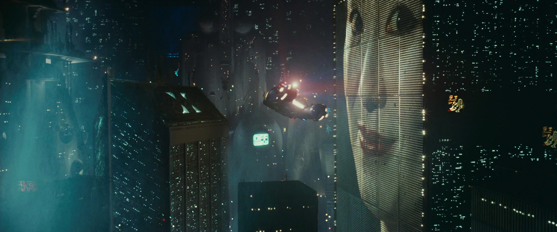
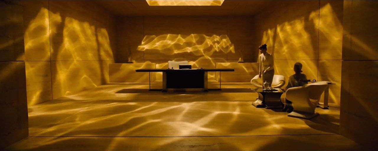
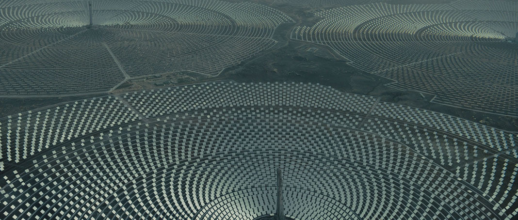
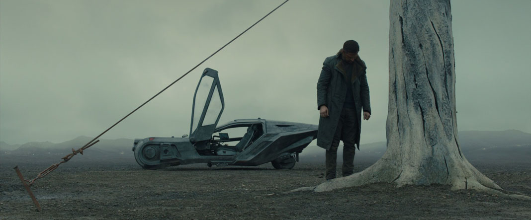
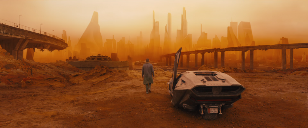
More recently, the cinematography for 2017’s Blade Runner 2049 was pretty stunning. The cinematographer was Roger Deakins, who, no surprise, also did Sicario (2015). Screencaps...
