
October 20, 2020 – According to some guy on Quora: “The logo is displayed so that you can identify which channel it is.” I’m so glad he cleared that up. For a moment, I was worried the networks didn’t have their priorities straight. After all, what’s more important: knowing what network you’re watching, or actually enjoying the show you’re watching? As usual, the networks made the right choice.
(Screenshots taken with iPad, so a little skewed.)

Can you tell which network this is? Here’s a hint: it starts with an “H.” I don’t know if you can see it or not, but that’s an “H” in the bottom right-hand corner.
You have to admit, that H is huge. Speaking of history…is that the H of the History network logo or the Arc de Triomphe? They’re both about the same size.
This image is from a show called Falling Water. The guy looks like he needs some falling water for the side of his face. The bright light that’s melting his cheek is coming from the on-screen logo.
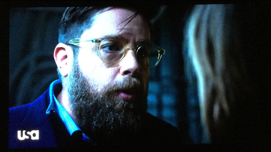
Don’t look directly into the sun, and don’t stare too long at the USA on-screen logo.

To be fair, Paramount has been around for a long time, founded in 1912. They may not know about “opacity.” They may not realize they can put their logo at 25% opacity, rather than the 1,000% they’re currently using.
This shot is from the docudrama called Waco. David Koresh wasn’t subtle either.
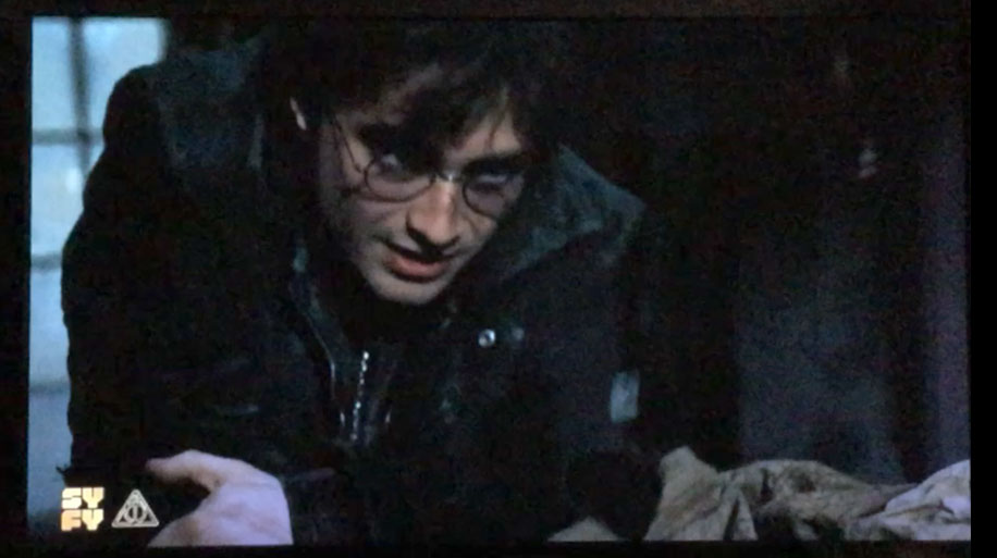
Syfy is short for science fiction, but the brightness of their logo is a fact. This shot is from a Harry Potter movie. With all of his magical power, even Harry couldn’t diminish the annoyance of this logo.
They also added in a Harry Potter-specific magic symbol. This shows that they know what’s going on in the Harry Potter world – which is more important to them than annoying us with something else on-screen.
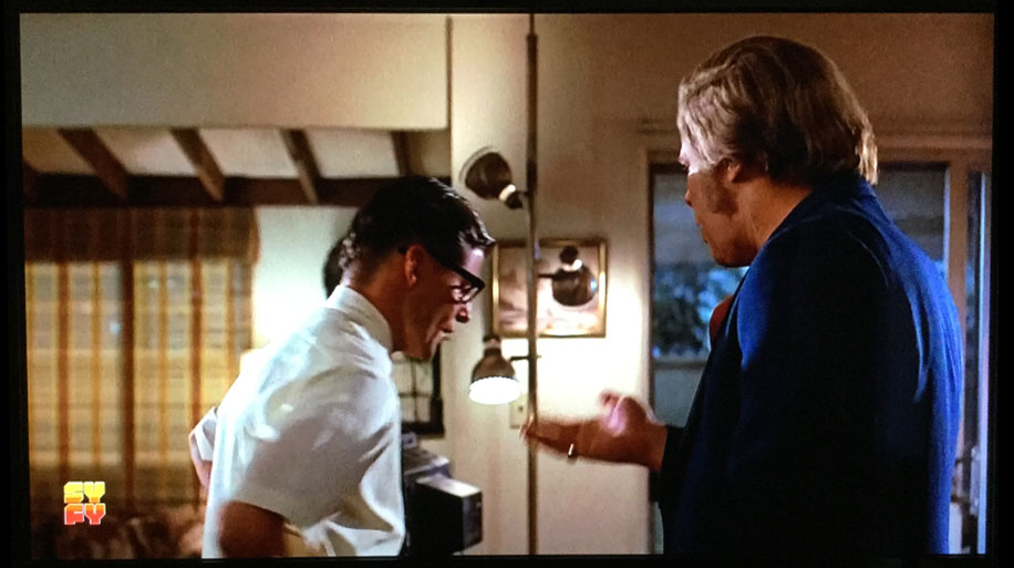
This is a shot from Back to the Future. If your goal is to annoy viewers, it seems like a white or yellow on-screen logo at 100% opacity would get the job done. But SyFy came up with something even more annoying: a multi-colored logo.
To be fair, they made their logo try to match the Back to the Future logo in look and feel. Still, it would look a lot better, and we would feel a lot better, if they didn’t show any logo at all.
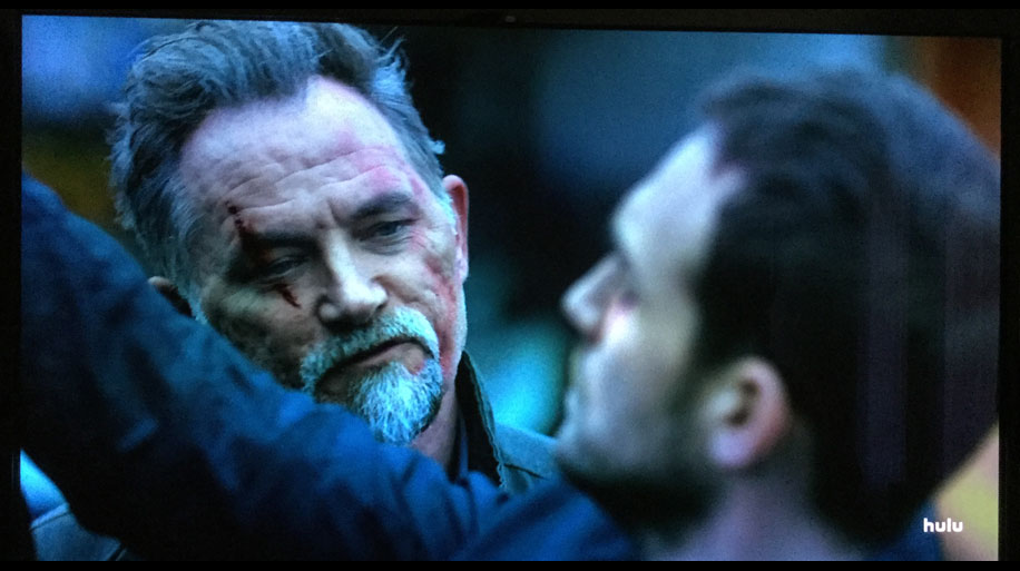
This one is particularly irksome. It’s not just major networks and cable networks doing on-screen logos, now a streaming platform (Hulu) also felt the need.
This shot is from a show called Helstrom. Exactly. What the helstrom, Hulu? Hopefully Netflix, HBO, and others won’t follow suit. Can you imagine watching The Crown or Game of Thrones with an annoying logo on-screen at all times?
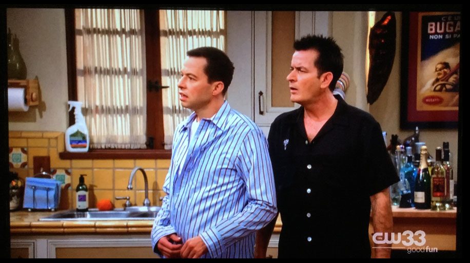
This shot is from Two and a Half Men, a show I don’t consider to be funny because its humor is dumbed-down to hit as wide an audience as possible. But the on-screen logo is there to correct me. This show is “good fun.” My mistake.
I appreciate that the logo isn’t at full opacity, but dang it’s large, isn’t it?

Another irksome evolution: it’s not just on-screen logos, nowadays it’s also on-screen ads.
The BBC America logo is annoying enough: huge and bright. But they’re also advertising another one of their shows, Top Gear, on-screen as well. And it’s not like the ad went away. It stayed on-screen.
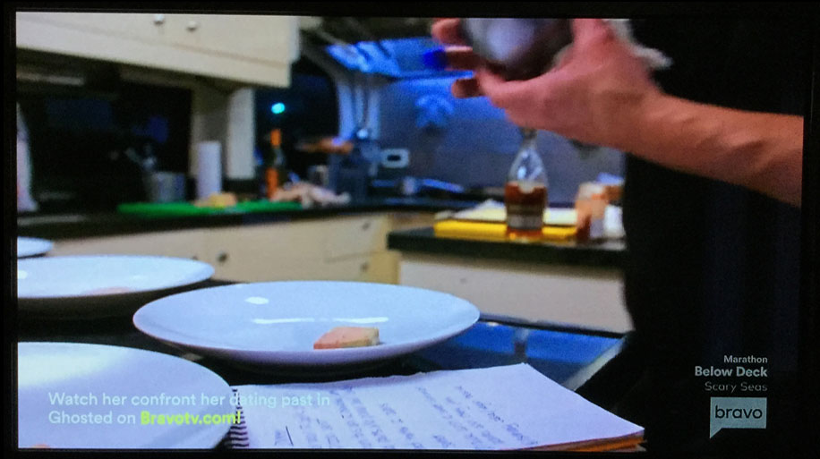
Bravo to Bravo for at least being aware of opacity. The on-screen text is subtle. The problem is, there’s so much of it. This shot is from a reality show called Below Deck. Bravo definitely went overboard:
Marathon
Below Deck
Scary Seas
[Bravo logo]
Watch her confront her dating past in Ghosted on Bravotv.com!

MTV appears to be in a competition for the largest on-screen logo. While the logo takes up only about 2% of the entire screen, it seems much larger. Such is the fate of on-screen logos. They’re optical illusions. Because they’re so annoying, they appear much larger than they actually are – like a pimple on your face when you’re a teenager.
Though this shot is from a movie called Love Don’t Cost a Thing, this logo is costing us plenty. When you watch a movie or non-reality show, you want to escape into that movie’s/show’s world. The networks know this. All people know this. So why have an on-screen logo that takes you out of the world of that movie/show?

This logo is brilliant. Brilliant as in really bright. An added benefit: we not only know the network name, we know the season we’re in. They’ve added leaves to the logo to let us know it’s Fall. Then the cheesiest, most annoying on-screen ad ever created lets us know that Christmas is near.
But what can you expect from a network whose movies make daytime soaps look like Shakespeare.

The full name of this network is E! Entertainment Television. There’s nothing entertaining about on-screen logos, especially ones this large. (That E is as big as the History logo’s H.) There’s also nothing entertaining about huge, accompanying on-screen text.
But apparently, what all of the networks are telling us is, our entertainment isn’t the priority.